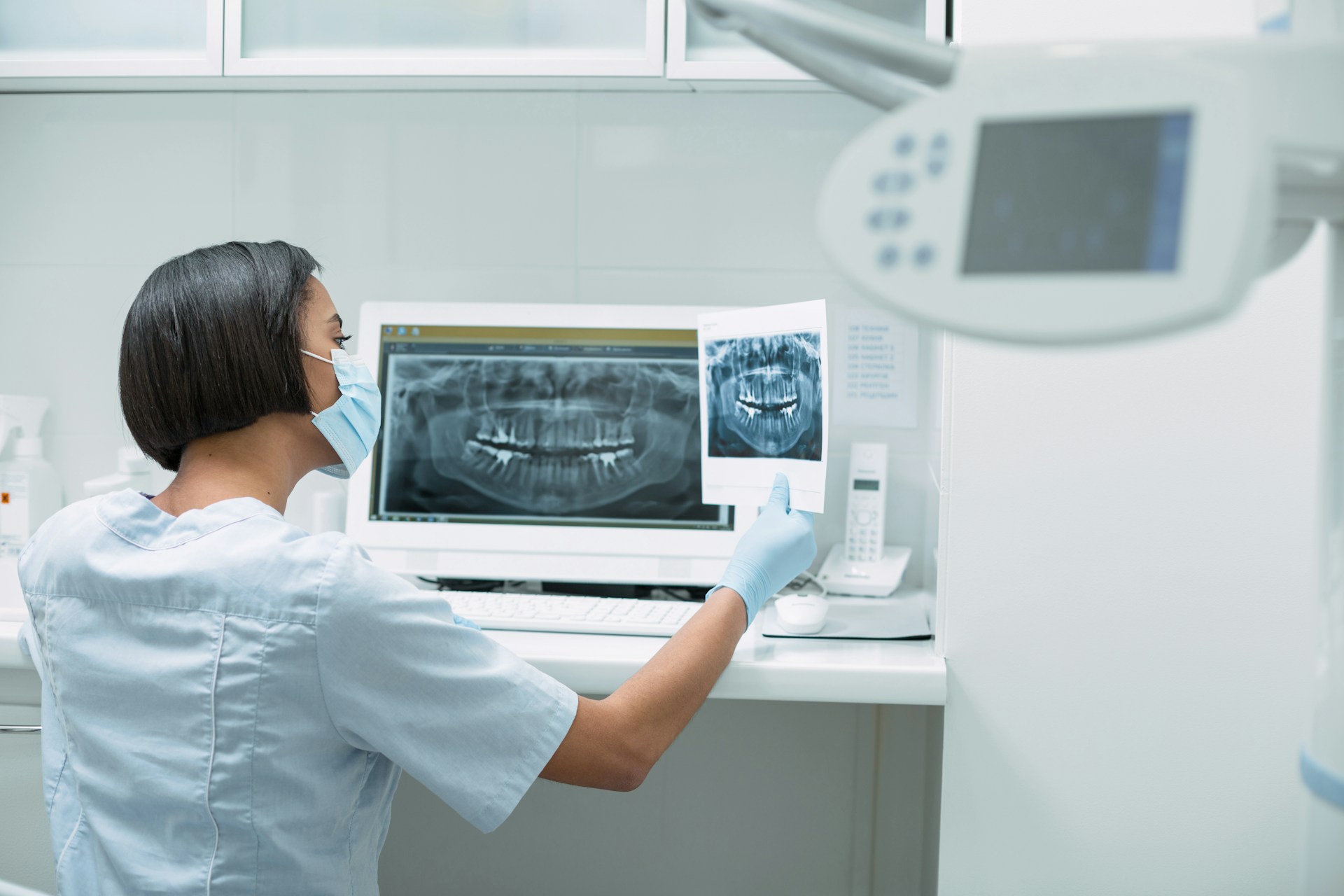
Turn Everyday Charting Into Reliable KPIs
Dental groups usually are not short on data. Every visit, every note, every treatment plan lives inside your dental charting software. The real problem is trusting that data when you sit down to review KPIs like production per visit, hygiene reappointment rate, or treatment acceptance. If the numbers feel shaky, leaders stop using them to drive decisions.
Most of the time, the issue is not the reports. It is what happens in the operatory. Small differences in how providers chart, which codes they pick, or how teams mark “accepted” versus “proposed” treatment can turn clean data into noise. When systems are disconnected, it gets even messier. Clinical notes live in one place, scheduling in another, claims in a third, and no one is sure which version is “right.”
With the right setup, your dental charting software can be more than a digital chart. It can be a steady source of KPIs your team actually trusts. The American Dental Association explains how practice metrics work in its guide on key performance indicators, but the quality of those numbers comes down to how clean your clinical data is.
Late summer is an ideal time to focus on this. Q3 and Q4 are when many groups lock in year-end reporting and plan for the next year. If your charting is tuned up before that, your production, collections, and clinical KPIs will be based on real behavior, not guesses or manual spreadsheets. Groups that align charting with KPIs often see results like $40K per month in additional revenue from better follow up on unscheduled treatment, 33 percent faster claims, and 17 percent more claims processed with the same team.
Why Your Charting System Determines KPI Quality
When we say “reliable KPIs” for a group or DSO, we mean numbers that are:
- Repeatable month after month
- Consistent across providers and locations
- Clear enough that both clinicians and operators agree on what they mean
Breakdowns usually start in the charts:
- Providers use different diagnostic codes for the same condition
- Procedures are started but never marked completed
- Treatment is marked as “accepted” in notes but never linked to a schedule event
- Teams mix “proposed,” “planned,” and “scheduled” without shared rules
None of this feels like a big deal in the chair. But at scale, it causes real pain. Untracked unscheduled treatment stacks up. Hygiene reappointments look better on paper than in reality. Leaders debate who is “right” instead of seeing one shared number.
The hidden cost shows up as:
- Missed follow up on unscheduled treatment that can be worth tens of thousands each month
- Confusing provider performance reports that do not match how clinicians feel they are working
- Tension between the front desk, operations, and doctors about why their reports do not match
A modern charting platform has to be judged on more than chairside speed or interface. It should be part of a connected practice management system where charting, scheduling, and analytics speak the same language. If your PMS does not structure data clearly, your KPIs will always feel a bit off.
What To Look For In Dental Charting Software
Think of dental charting software as practice management infrastructure. It shapes how information flows from the operatory chair to the leadership dashboard. Pretty screens are nice, but structure matters more.
Here Are Key Things to Look For
- Standardized templates
Templates for exams, perio, and common procedures reduce free text notes. When everyone uses the same structure, you get consistent data across providers and locations.
- Strong link between charting and scheduling
Accepted treatment should move naturally from the chart into scheduled visits. When this link is clear, KPIs like case acceptance, unscheduled treatment, and production per visit are based on real events, not manual flags.
- Role-based workflows
Hygienists, associates, and specialists should each have a workflow that fits how they work, while still following the same data rules. If charting slows them down, they will find shortcuts, and quality will suffer.
When these pieces are in place, you see the benefits everywhere:
- Cleaner claims with fewer corrections
- Fewer rework cases caused by unclear notes
- More accurate metrics on treatment acceptance and perio protocol adherence
- A clearer view of recall effectiveness and hygiene capacity
Your charting system should plug into a broader platform that also covers practice management and patient communication. For example, a connected PMS such as practice management software that ties charting to scheduling, billing, and claims can keep your clinical work and operations in sync.
The Dental App is a cloud-based dental software platform that unifies practice management, patient relationship management, and analytics for growing dental groups and DSOs.
Turning Clinical Notes Into Trustworthy KPIs
The real benefit shows up in the bridge between chairside charting and leadership reporting. Every time a provider charts existing conditions, proposes treatment, and completes a procedure, that event should quietly feed your KPIs.
With structured clinical data, you can track:
- Provider-level case acceptance, without pulling reports into spreadsheets
- Preventive versus restorative mix by practice or region
- Hygiene capacity, reappointment rate, and perio maintenance follow-through
When charting is linked to claims and scheduling, several things get easier at once. Your billing team does not have to reinterpret notes. Claims go out with the right codes the first time, which can support 33 percent faster processing and 17 percent more claims handled with the same staff effort. That improves cash flow and helps validate your production and collections KPIs.
You also gain confidence in quality measures. If perio charting uses shared templates and rules, you can see where perio maintenance is strong and where it drops off. Because the data starts in the chart, not in a spreadsheet, leaders can trust that the trends match what is really happening in operatories.
The Dental App is dental charting software that surfaces clinical and operational insights for dentists and multi-site operators who need reliable, real-time KPIs.
Evaluating Charting Platforms For Group And DSO Growth
Choosing charting software for a group is different from choosing for a single office. You are not only picking tools for today. You are picking the data model your leadership team will live with across locations.
A KPI-centric evaluation checklist can help:
- Can you define and standardize charting protocols across all locations, then confirm they are being followed?
- Can operations trace any KPI on a dashboard back to specific clinical events in the chart?
- Can you segment data by provider, location, payer, and procedure type without dumping data into outside tools?
- Can your team manage both clinical notes and patient communication inside one connected system?
A connected platform that links PMS, PRM, and analytics keeps your loop closed. For instance, patient relationship management tools tied to the same data as your charts help you track recall and reactivation results as part of the same story, not as a separate project.
Implementation also matters. Standardized charting is a change in habits, not only a change in software. Many groups see better adoption when they:
- Start with one specialty or region
- Set clear charting standards and give simple cheat sheets
- Use real examples from their own charts in training
- Phase rollout so teams are not changing systems during the busiest weeks
During the second half of the year, you can phase in new rules, clean up code sets, and align your teams before year-end reviews. As groups put these structures in place, they often uncover $40K per month in additional revenue potential and can move to 33 percent faster claims that support 17 percent more claims processed without adding headcount.
The Dental App is practice management software that connects charting, operations, and analytics so group leaders can trust the KPIs they review in monthly and quarterly meetings.
How The Dental App Turns Charts Into Leadership Reports
Let us put this into a simple workflow.
A hygienist opens the chart and records existing conditions and risk factors using standard templates. They note proposed treatment and recommended recall interval. The doctor reviews, adjusts the plan if needed, and presents it. The patient accepts some or all of the plan, which the coordinator schedules using the same structured treatment items. When the work is done, procedures are completed directly from that plan.
From that one flow, you can track:
- Unscheduled treatment by value and by procedure type
- Same day acceptance rate
- Provider production per hour
- Hygiene reappointment rate
- Follow through on perio maintenance
Because charting, schedule, and claims live in the same connected system, your team charts once and the data works many times over. Claims can be created from completed treatment with the right codes, which supports faster processing and a higher claim volume without adding more manual steps.
On the analytics side, your leaders should not need to be data experts. A connected analytics layer, like the one in real-time dental analytics tools, can turn those clinical events into dashboards that show where you are strong and where you are missing opportunities.
The Dental App is a cloud-based dental software platform that helps clinical teams chart naturally while giving executives a single, consistent source of truth for KPIs across every practice.
FAQs Dentists Ask About Dental Charting And KPIs
Is My Dental Charting Software Hurting My KPIs?
If your team argues over “whose report is right,” if you rely on manual spreadsheets to understand production or case acceptance, or if basic terms like “accepted treatment” mean different things to different people, your charting system is likely limiting your KPIs. Many groups also see slower claims processing and fewer claims handled per team member than they could achieve with a more structured approach.
Charting Standards a DSO Needs Before a Software Upgrade
Set shared templates and rules for exams, perio charting, diagnostic codes, and treatment statuses. Define exactly when a treatment moves from proposed to accepted to scheduled to completed, and make sure those definitions match how your leaders want to see the numbers. Clear standards make it easier to reach targets like 33 percent faster claims and 17 percent more claims processed without burning out your team.
Can the Dental App Use Existing Charts and Still Give Clean KPIs?
Yes. Historical data usually comes over through migration and mapping. From there, the key is setting clearer structure for new visits so future KPIs are cleaner. Many groups run legacy and new metrics side by side for a while, then shift fully once they trust the new data. As structure improves, practices often see up to $40K per month in additional revenue from more reliable follow up on unscheduled treatment.
Connect Clinical Charting to Claims Without Extra Work
The goal is chart once, then let the system drive codes and claims. When procedures are set up with clear code mappings, your team can complete treatment in the chart and have that flow into ready-to-send claims, which supports faster processing and more claims handled with the same staff. Many groups use this approach to reach 33 percent faster claims and 17 percent more claims processed with the same headcount.
KPIs to Expect From a Multi-Site Charting System
Common high-value metrics include provider productivity, hygiene reappointment rate, perio maintenance adherence, unscheduled treatment value, case acceptance by procedure type, payer level performance, and recall effectiveness across locations. When these are based on structured charting, you can connect them directly to operational changes and quantify impact, including additional revenue per month and improvements in claims speed and volume.
Turn Your Charts Into A Single Source Of Truth
Reliable KPIs start with disciplined, structured charting, not with fancy spreadsheets or after the fact data cleanup. If the data that enters your system is clear and consistent, your dashboards can finally match what providers see in the chair.
A practical next step is to pick a short list of KPIs you care most about, such as treatment acceptance, hygiene reappointment rate, and unscheduled treatment value. Then ask a simple question for each one: can your current dental charting software deliver that metric without side spreadsheets or manual counting? If the answer is no, it may be time to rethink how charting, operations, and analytics fit together so your group can grow on top of one shared, trusted set of clinical data and capture opportunities like $40K per month in additional revenue, 33 percent faster claims, and 17 percent more claims processed.
Transform Your Dental Charts Into a Clear Competitive Advantage
Streamline clinical documentation and give your team a charting workflow that actually supports great patient care with our intuitive dental charting software. At The Dental App, we focus on making charting fast, accurate, and easy to read so providers can spend more time with patients and less time fighting the screen. If you would like to see how this could work in your practice or have specific questions about your setup, contact us and we will walk you through the best options for your team.